Brand + PACKAGING DESIGN
Serene
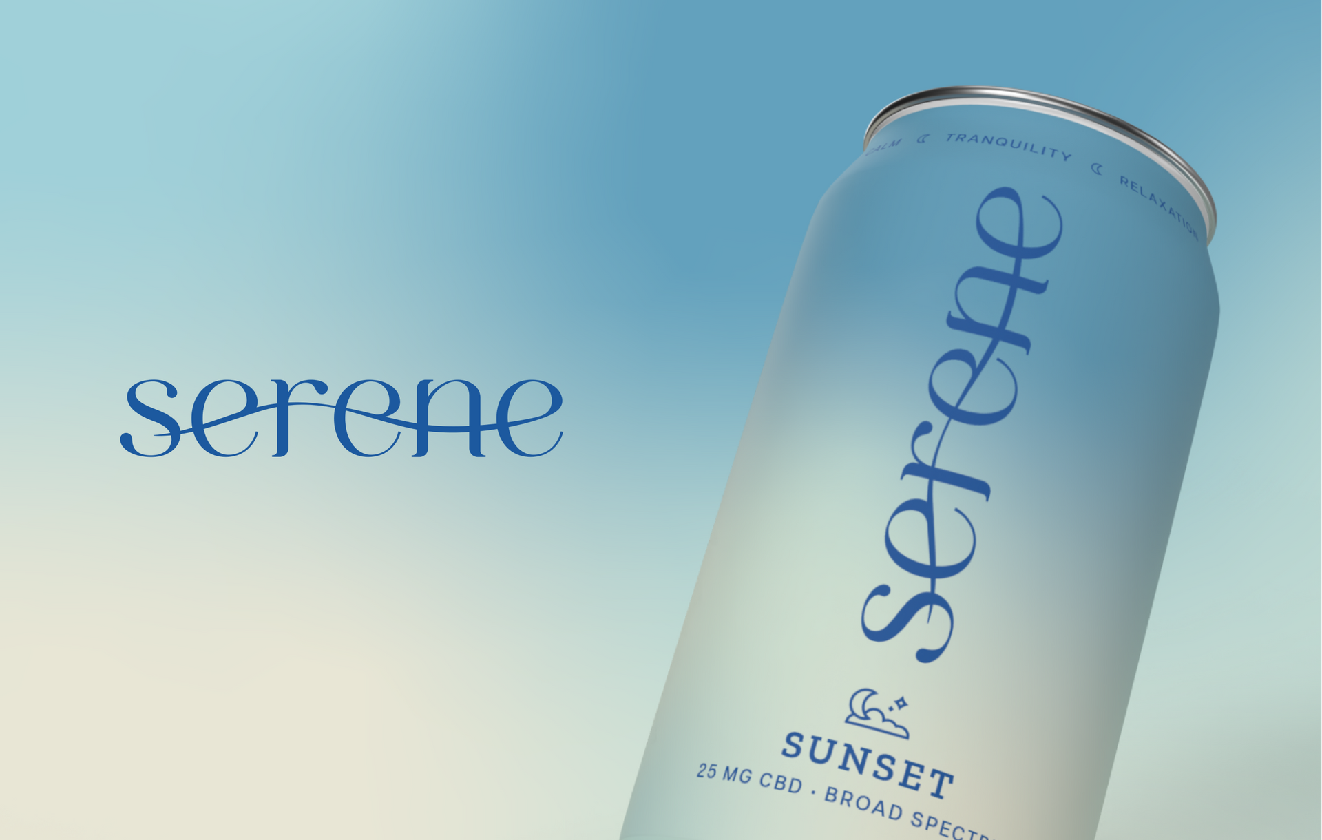
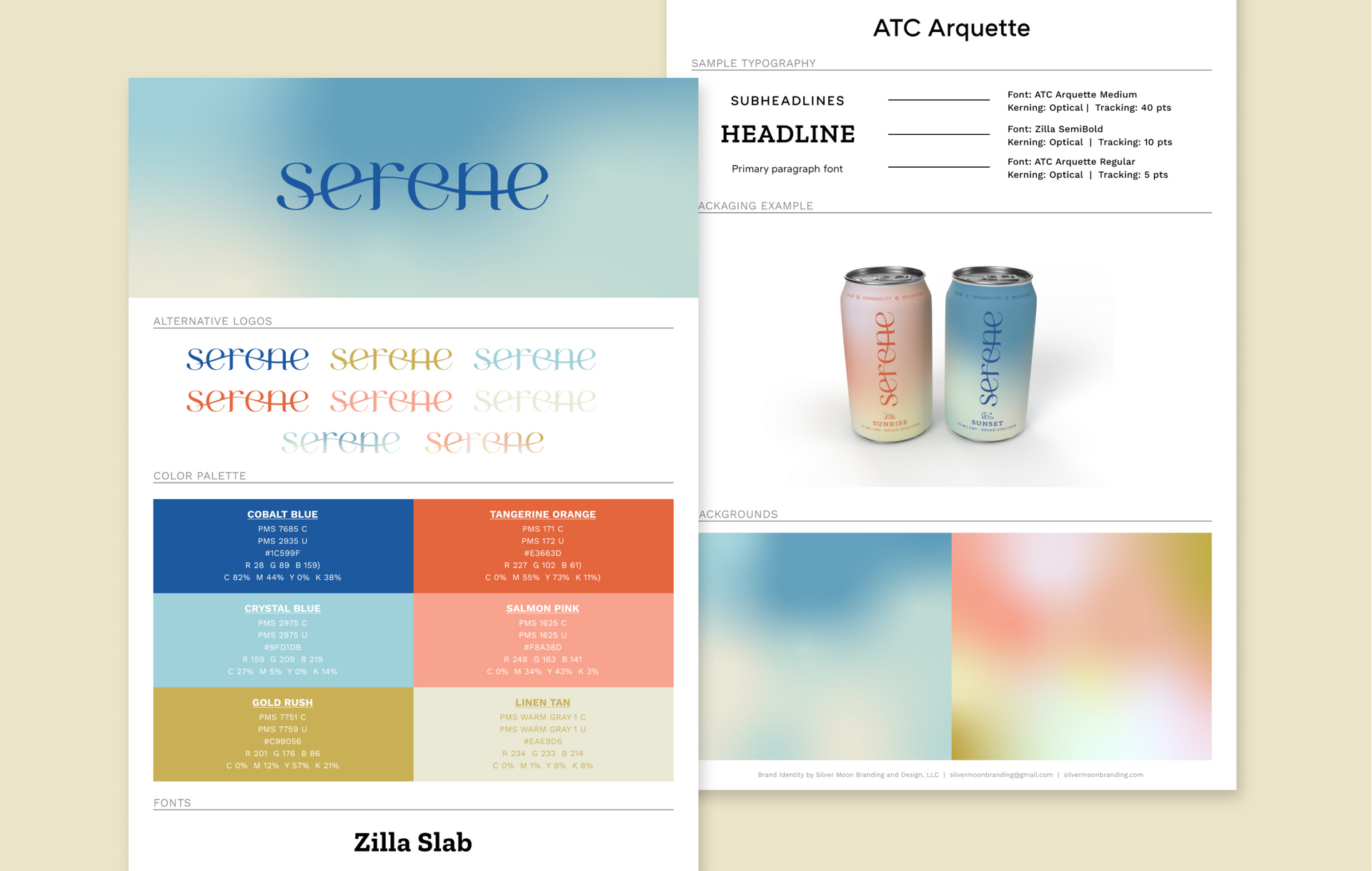
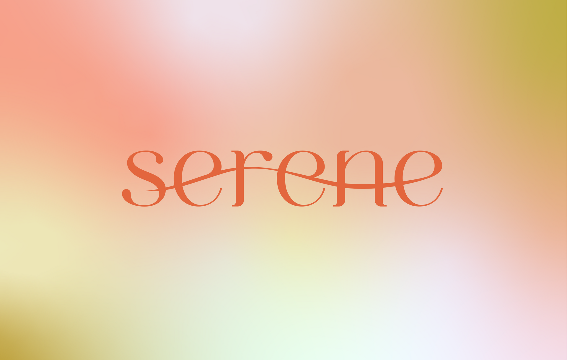
Drawing inspiration from a blurred landscape photograph, these serene and tranquil pastel designs capture the essence of the CBD beverage. The flowing swoosh that runs through the word "Serene" evokes a calming breeze or a gentle wave, tying each letter together seamlessly.
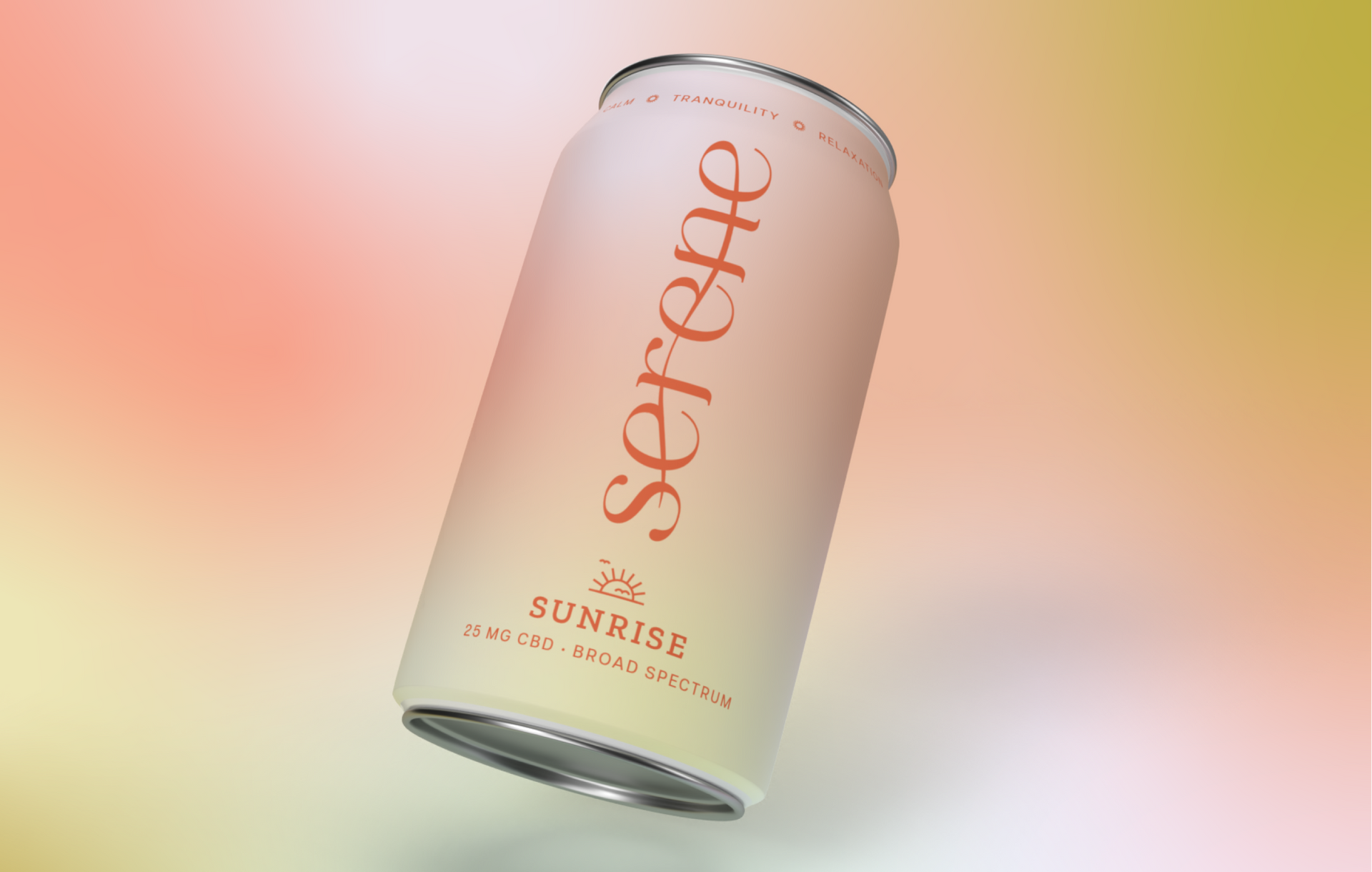
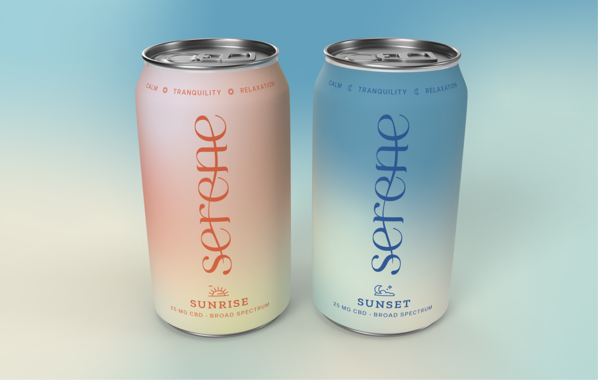
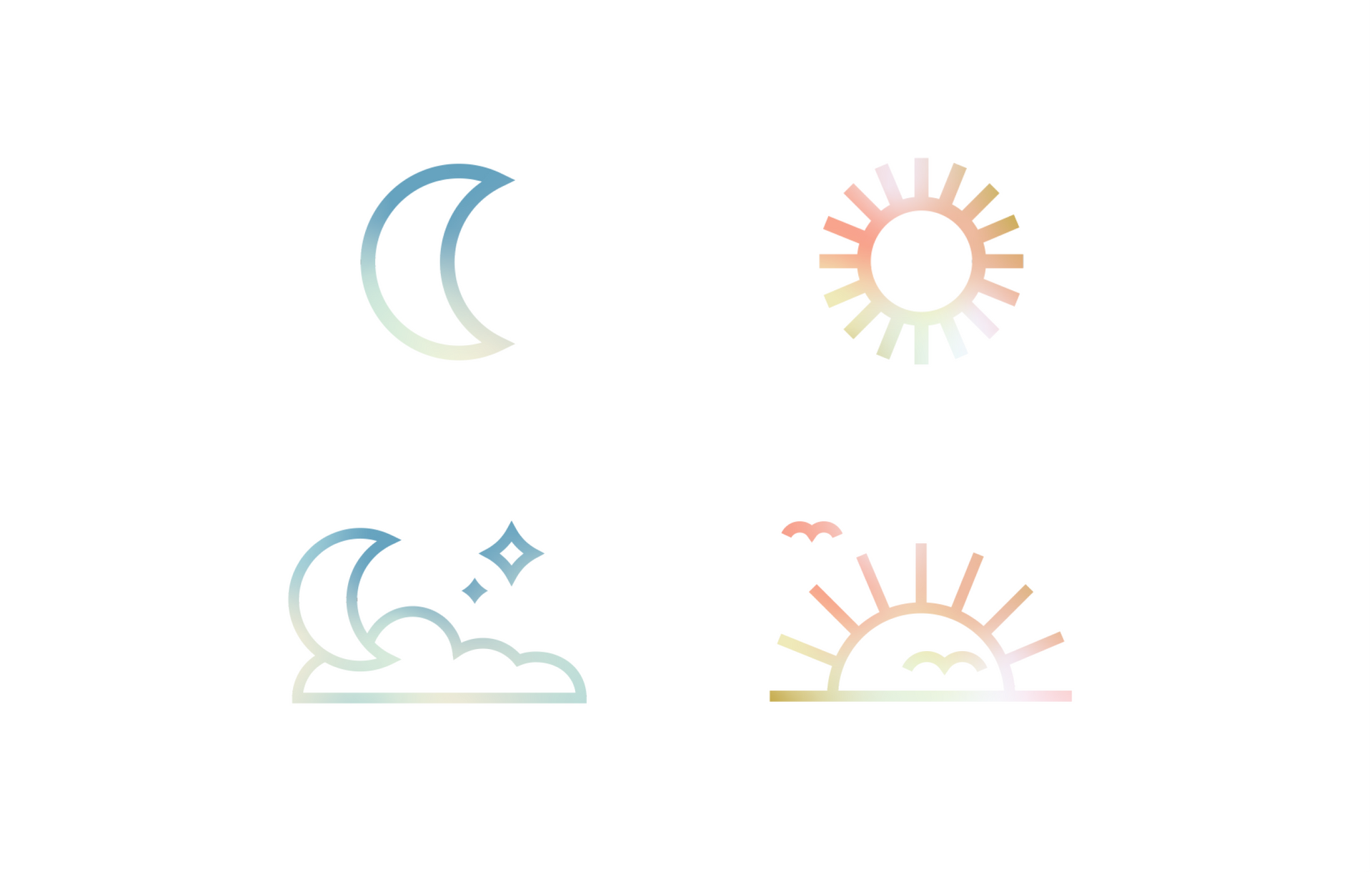
To create a striking contrast between the two CBD beverages, I used different color palettes that evoke the feeling of a sunny day versus a peaceful night. The Sunset design embodies relaxation and serenity, perfect for unwinding in the evening. In contrast, the Sunrise design exudes calm energy, ideal for starting the day on a peaceful note.
