PACKAGING DESIGN
R Shea Brewing
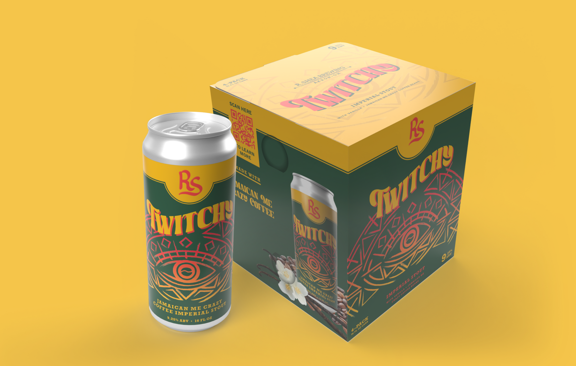
In this vibrant, competitive world of craft brewing, it's the label that often makes the first splash. R Shea Brewing from Akron, Ohio, got me on board to help them make just that kind of impact.
The challenge? Crafting label and packaging designs that would not only tie together to form a recognizable brand but also give each beer in the portfolio its unique identity. R Shea Brewing has a deep love for their local community, a respect for their roots, and a commitment to sustainable brewing practices - and they wanted all this to shine through in their label designs.
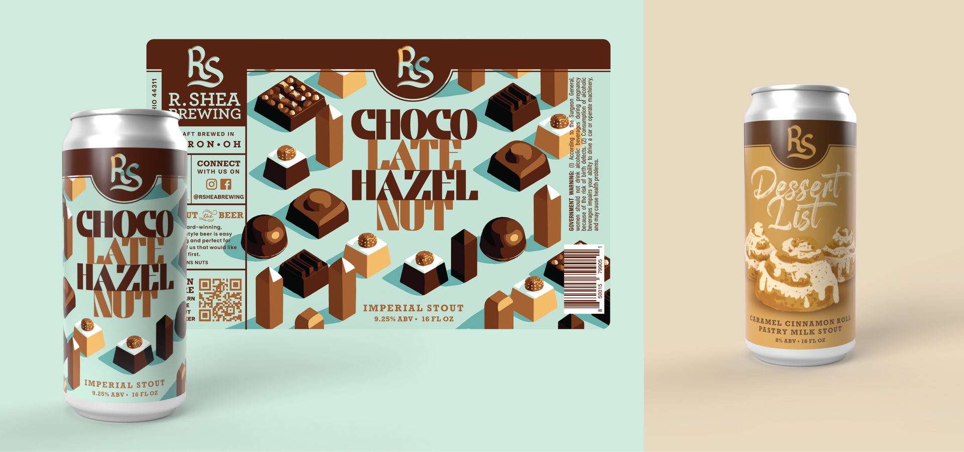
First things first, the client and I looked at the label template and decided it was time for a facelift. I whipped up a design that honored the previous label but really put the illustrations front and center. It was all about letting the beer's personality shine!
Of course, I also knew how important it was to keep beer lovers in the loop. So, I added an information panel at the back of the label, giving everyone the scoop on what's inside the can.
Now, about the colors – the old palettes R Shea was using had a heavier, darker feel to them. They expressed that they were interested in injecting a bit more life and color into the labels. And who could blame them? Bright, vibrant labels have a knack for catching your eye, and that's exactly what we wanted to do.
This project has been a playground for me! I had the opportunity to let my creativity run wild, weave stories into design, and use design principles to bring a series of beer can labels to life. These aren't just pretty labels – they're tools that drive brand recognition and business growth. I'm absolutely thrilled with how they turned out and can't wait to dive into our next creative adventure!

