


Brand + PACKAGING DESIGN
Powerful Pepper Jam
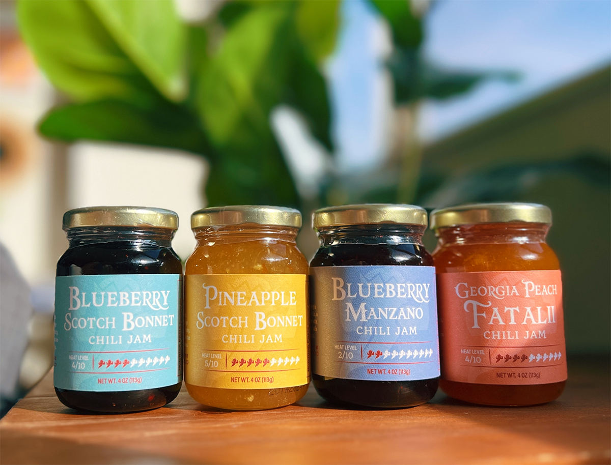
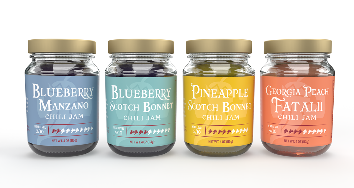
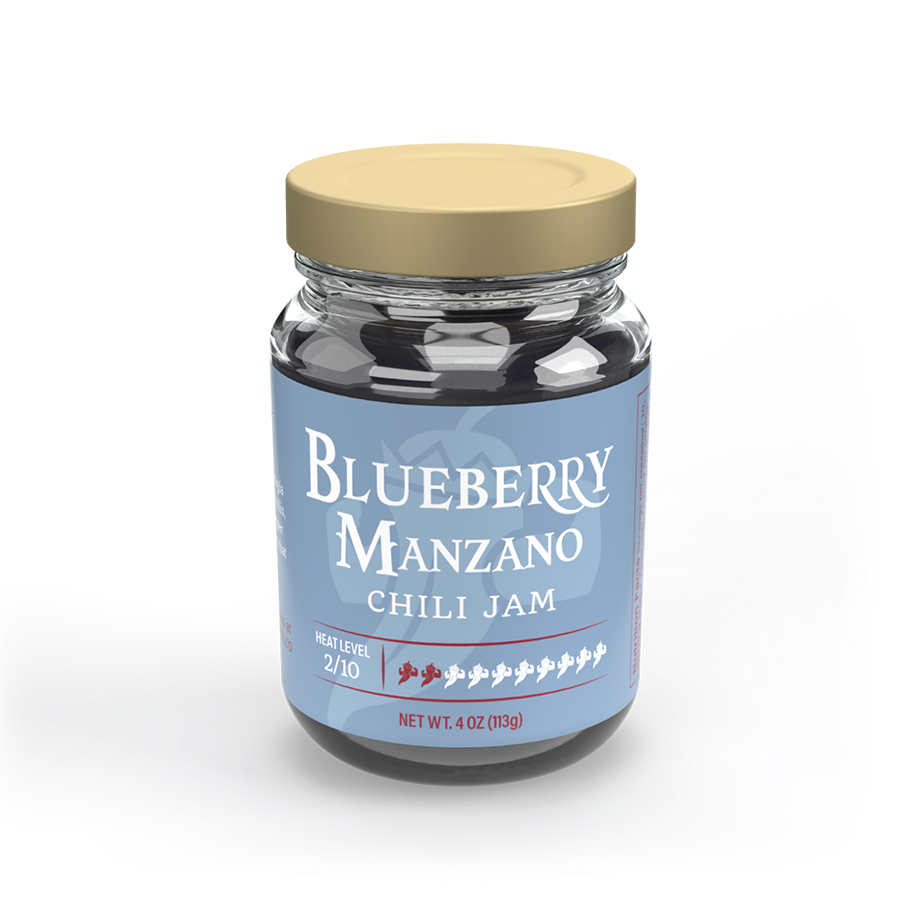
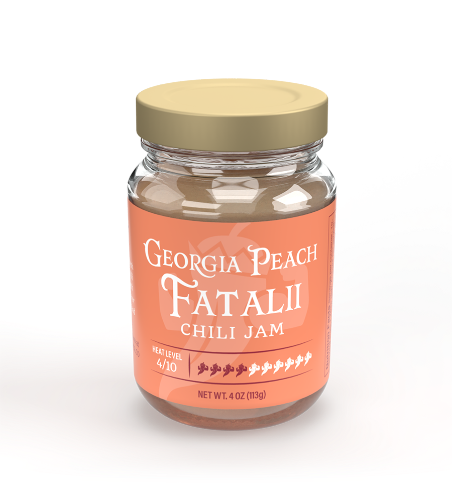
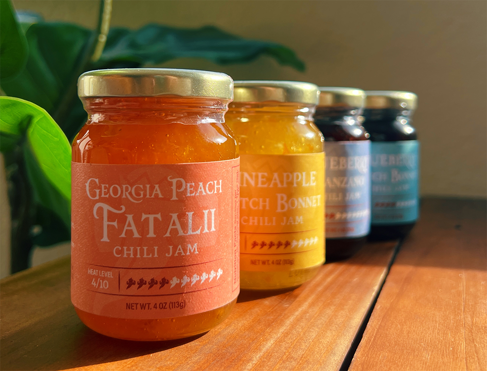
For this label redesign project, my goal was to create a clean, cohesive look that would unify the product line while highlighting each flavor's unique profile. I used maroon as the main color to tie back to the brand's overall color palette and chose complementary colors for each flavor.
One fun design feature is the pepper scale, which indicates the heat level of each jar. I used different colors for the logo icon to represent the heat levels, making it both informative and on-brand.
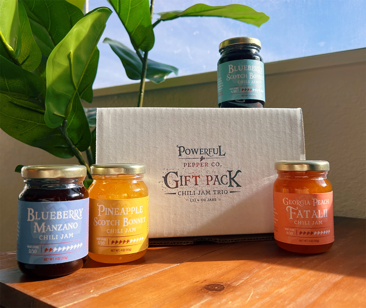
For the Gift Pack, which includes three jams, the client wanted a stamp for affordable shipping. I love finding budget-friendly solutions that still look professional, so I made sure the stamp met their needs without compromising on quality.
This is a paragraph. Writing in paragraphs lets visitors find what they are looking for quickly and easily.
This is a paragraph. Writing in paragraphs lets visitors find what they are looking for quickly and easily.
This is a paragraph. Writing in paragraphs lets visitors find what they are looking for quickly and easily.
This is a paragraph. Writing in paragraphs lets visitors find what they are looking for quickly and easily.
This is a paragraph. Writing in paragraphs lets visitors find what they are looking for quickly and easily.
Name Lastname
Title
Name Lastname
Title
Name Lastname
Title