Brand + PACKAGING DESIGN
La Playita Gin
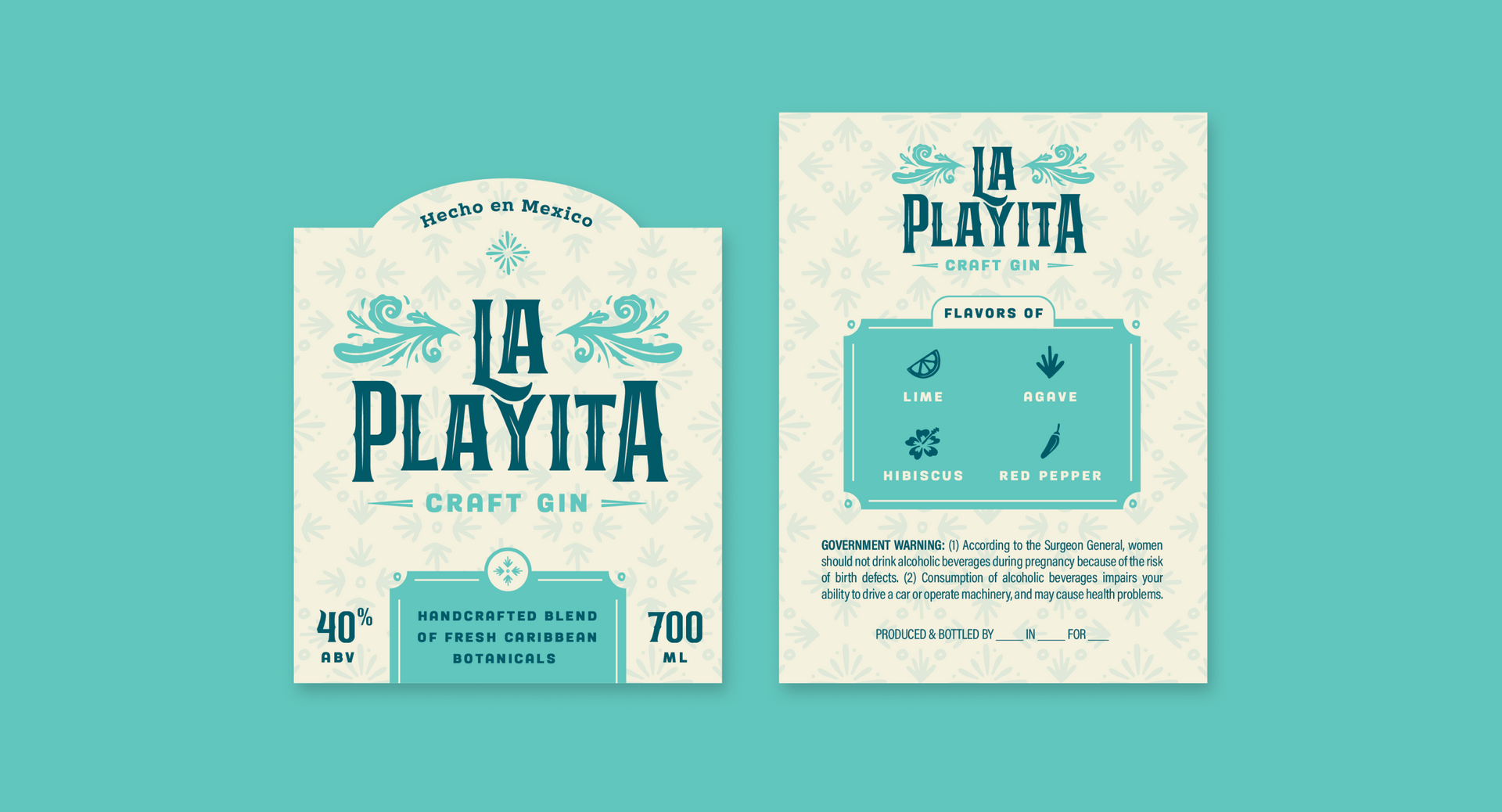
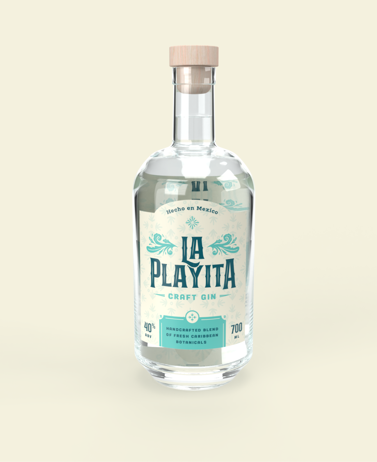
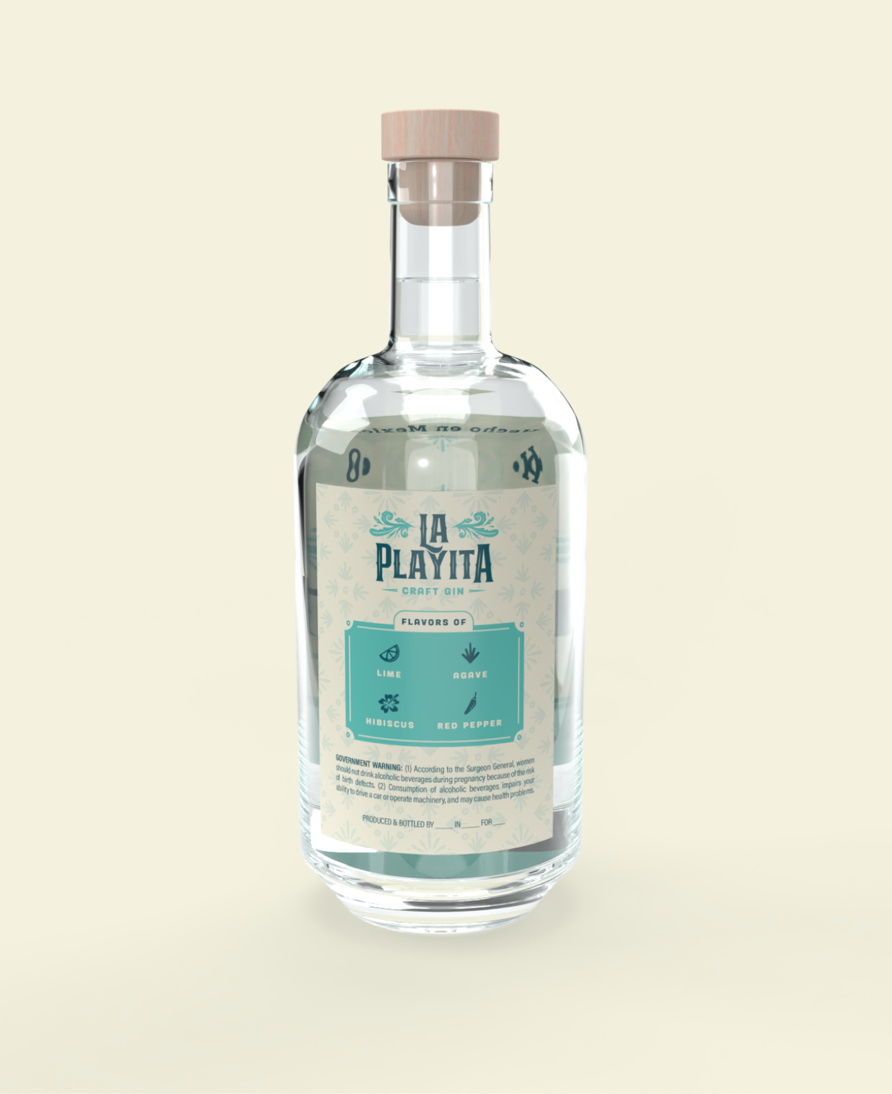
La Playita Gin's design portfolio encapsulates the vibrant spirit of Mexican beaches by seamlessly blending handmade elements with structured panels, creating a harmonious marriage of authenticity and sophistication. The carefully crafted patterns, icons, and flourishes were meticulously hand-drawn, infusing a personal touch that resonates with the brand's commitment to artistry. The color palette, featuring cool blues and rich creams, evokes the serene beauty of ocean waves and the warm sands lining Mexico's picturesque coastline. This design approach not only reflects the brand's playful essence but also establishes a visual identity that transports consumers to the idyllic shores of La Playita, where every sip promises a delightful escape to the sun-kissed beaches of Mexico.
This is a paragraph. Writing in paragraphs lets visitors find what they are looking for quickly and easily.
This is a paragraph. Writing in paragraphs lets visitors find what they are looking for quickly and easily.
This is a paragraph. Writing in paragraphs lets visitors find what they are looking for quickly and easily.
This is a paragraph. Writing in paragraphs lets visitors find what they are looking for quickly and easily.
This is a paragraph. Writing in paragraphs lets visitors find what they are looking for quickly and easily.
Name Lastname
Title
Name Lastname
Title
Name Lastname
Title


