Brand + PACKAGING DESIGN
Kaizen Wine
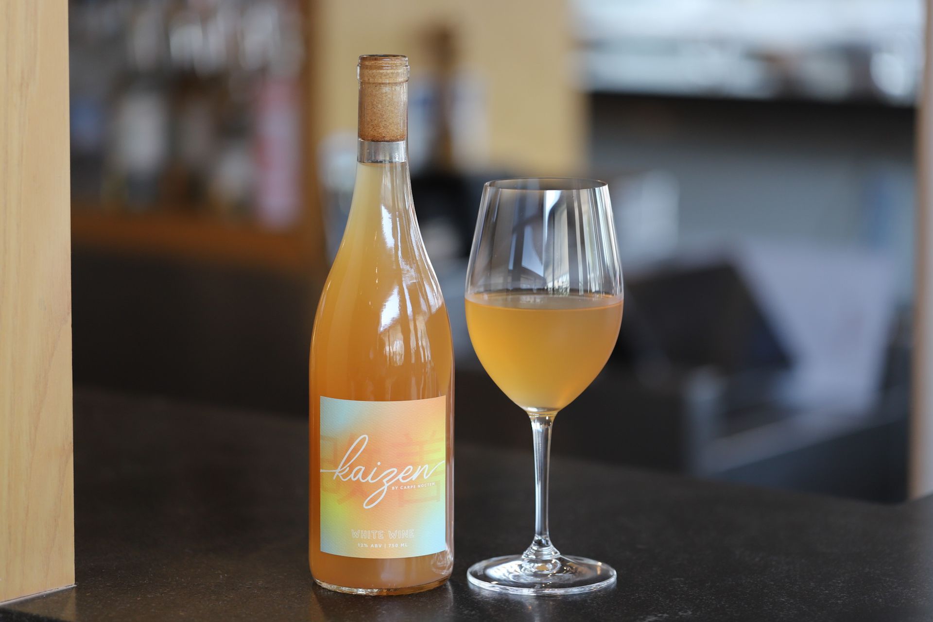
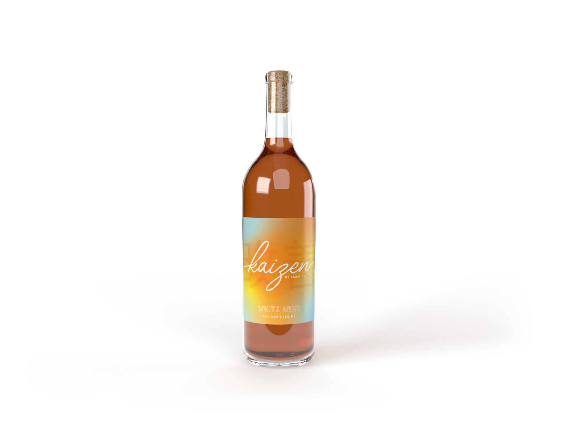
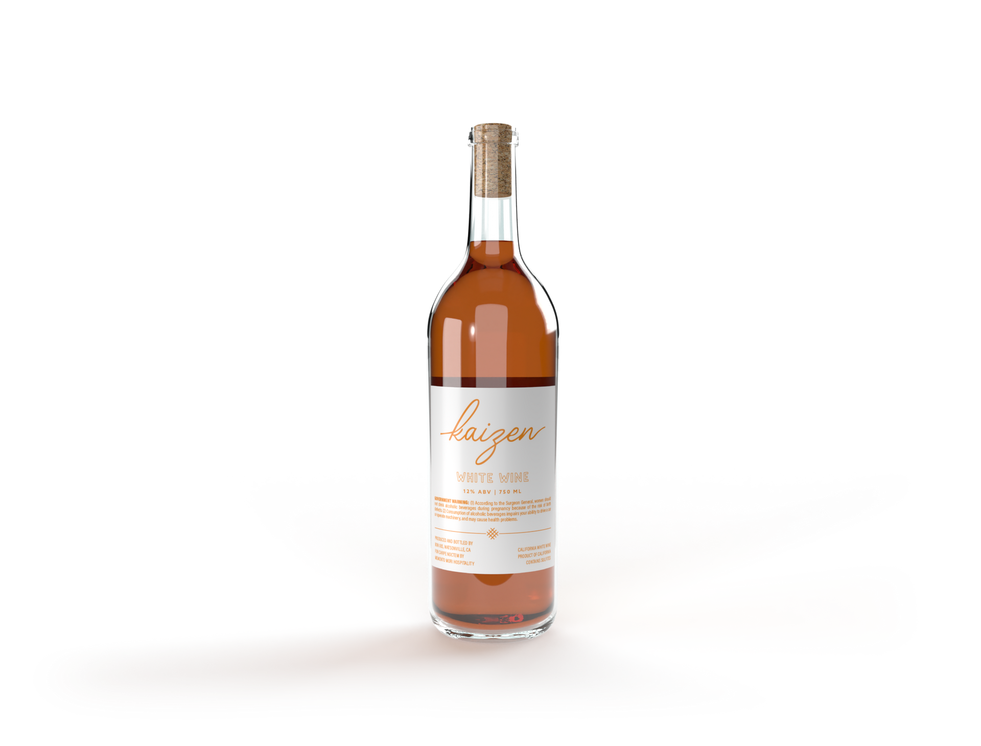
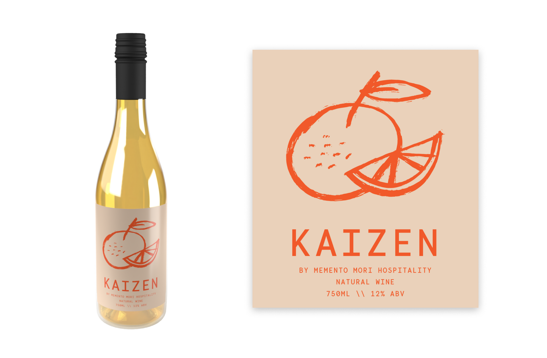
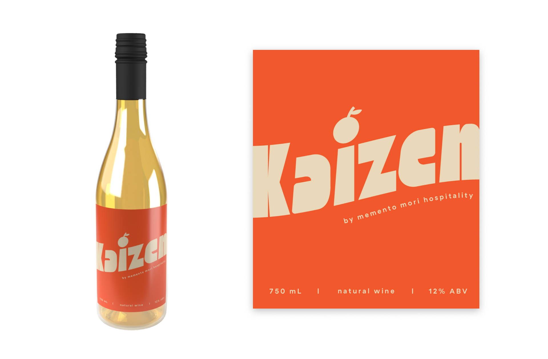
As the graphic designer for the restaurant group behind Kaizen, I had the pleasure of bringing this natural orange wine to life visually. Kaizen, which means "constant improvement" in Japanese, encapsulates the philosophy of our wine. I was dedicated to creating a label that truly reflects this ethos.
To capture the vibrant essence of Kaizen, I chose colorful and playful fonts ensuring it stands out on their tables. The design embodies the dynamic and evolving nature of the wine, celebrating both innovation and tradition. Collaborating on Kaizen was an exciting journey, blending aesthetic appeal with the wine’s rich, authentic flavor profile. Together, we crafted a visual identity that mirrors the spirit of continuous progress and the joy of discovery with every bottle.
