Brand + PACKAGING DESIGN
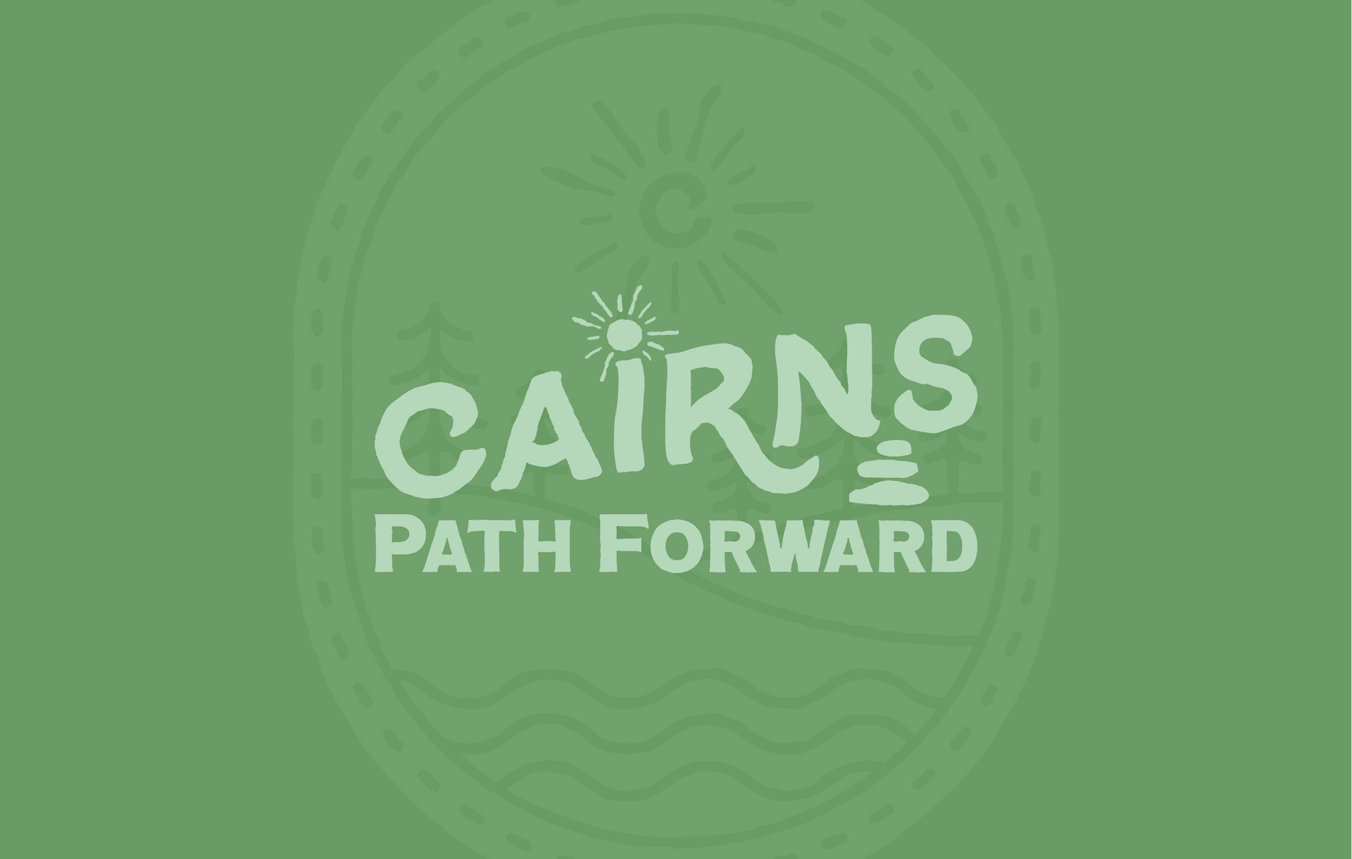
Cairns Path Forward
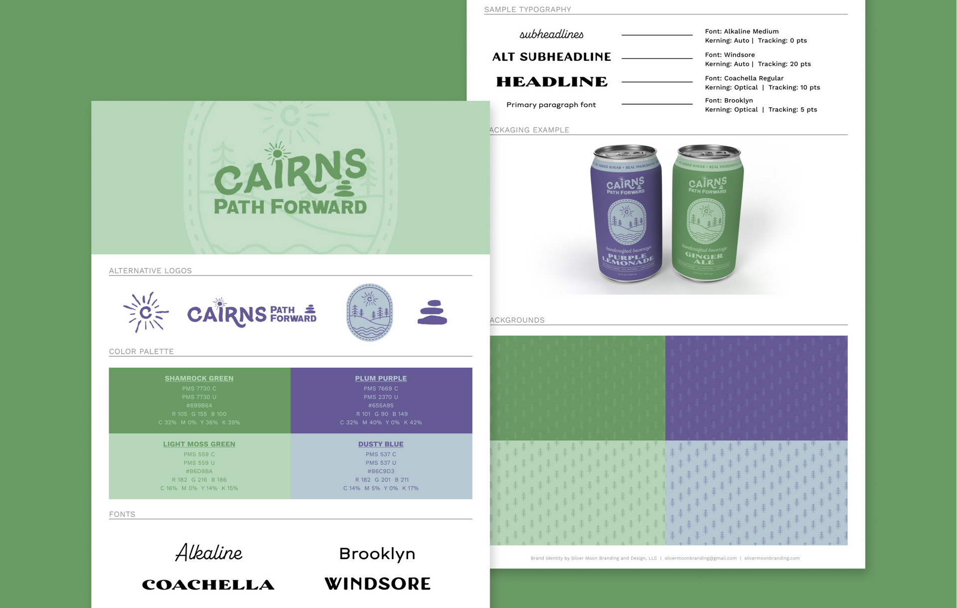
A brewery sought my expertise to create packaging for their new line of non-alcoholic canned drinks to cater to their customers who prefer non-alcoholic options.
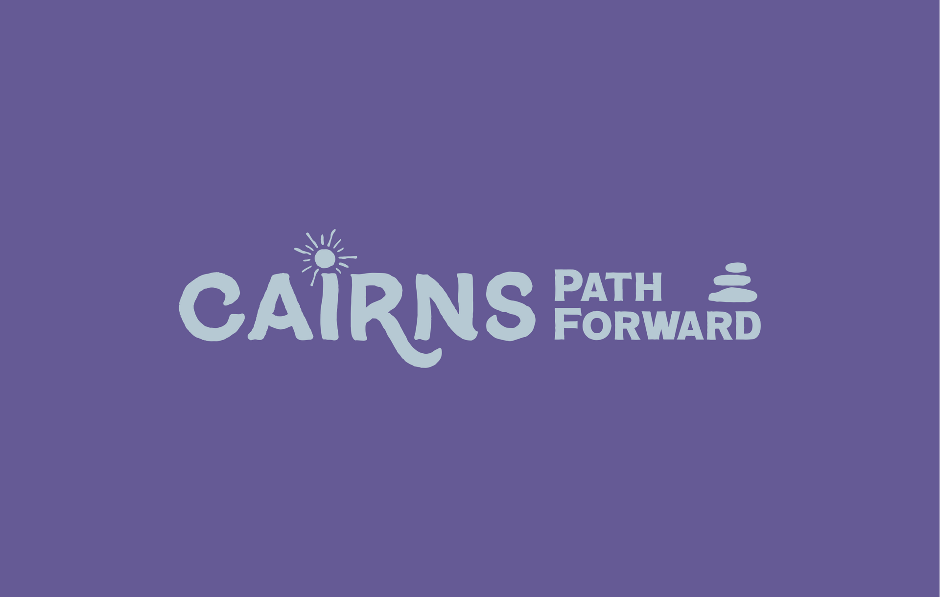
Inspired by the stacked rocks called cairns found on hiking trails, I aimed to evoke a handmade, natural woodland vibe for the brand by adding slight imperfections and roughening the edges of the letterforms. The brand's primary flavors, purple lemonade and ginger ale, served as the foundation for the color palette selection.
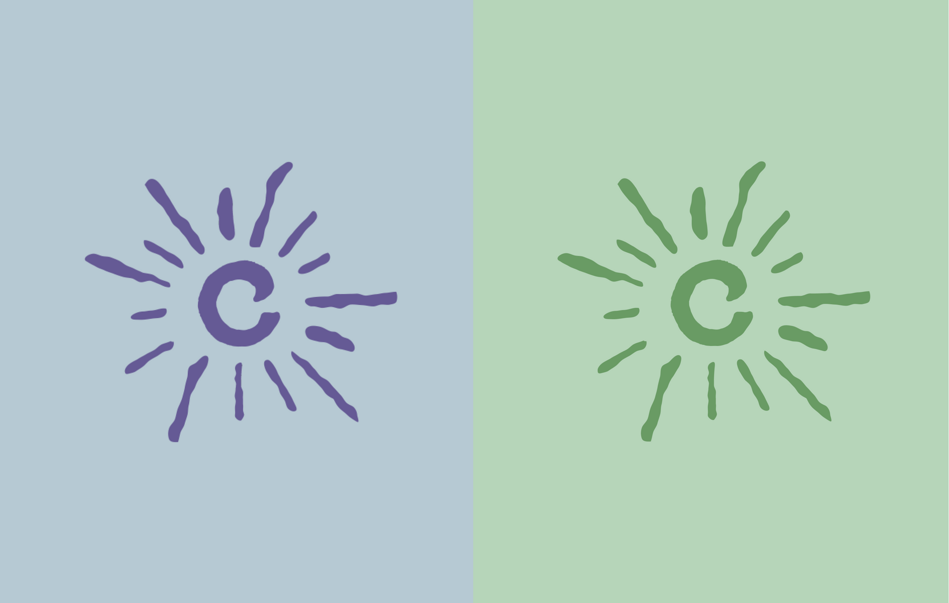
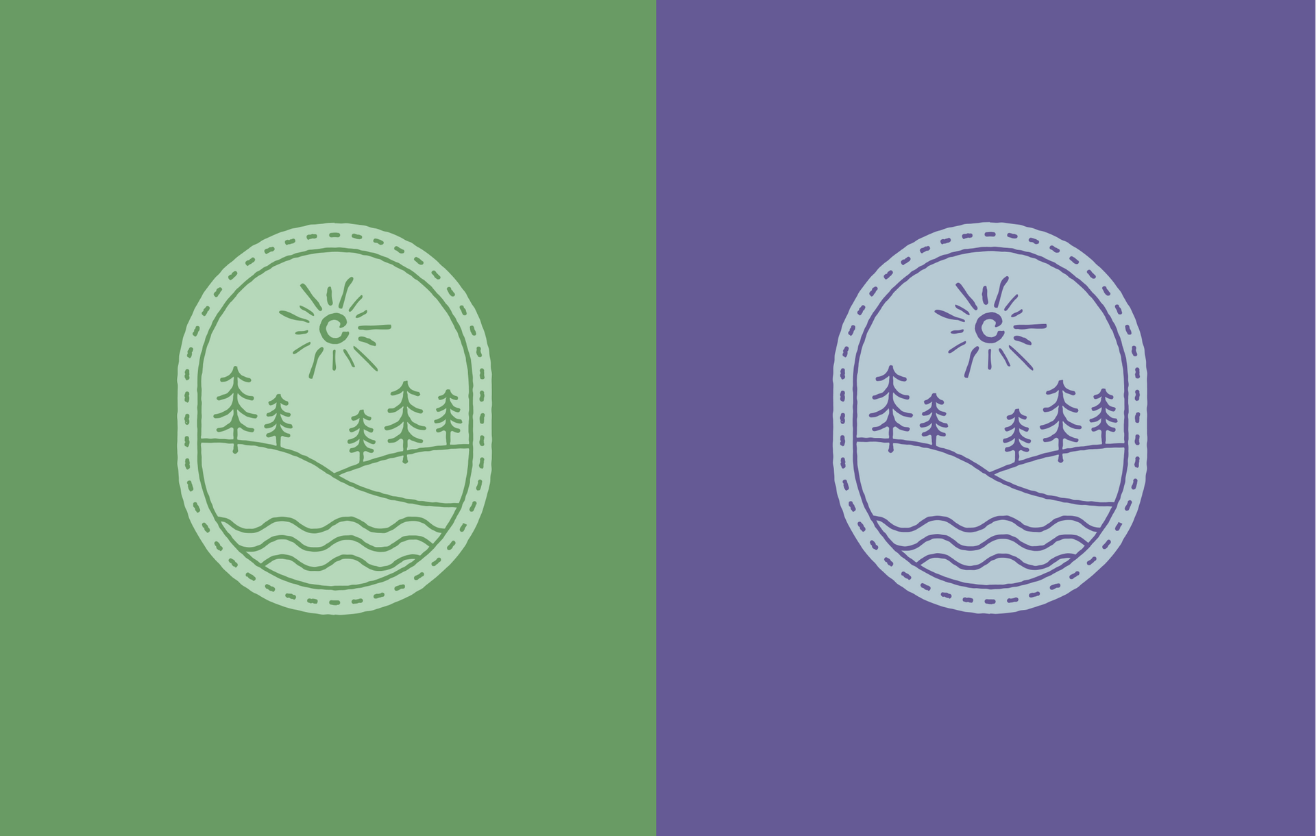
To represent the brand's connection to nature, I designed a nature scene with a river, rolling hills, and a letter "C" sun inside an oval badge with a stitched-looking border. The overall design is versatile and can be adapted for future flavors and color combinations.
