PACKAGING DESIGN
BeeFuel
This packaging design for BeeFuel Performance Drink is a bold, sleek, and modern representation of a high-energy lifestyle product. The visual design prioritizes functionality and aesthetics, delivering a strong impression of both performance and natural ingredients.
Key Design Elements:
- Typography: The vertical "BEE FUEL" text creates a commanding presence on the bottle, reflecting strength and endurance. The clean, sans-serif font ensures readability and aligns with the brand's modern appeal.
- Color Palette: The dominant black background symbolizes sophistication and focus, while the vibrant flavor indicators (red, orange, and purple) clearly differentiate product variants. The subtle honeycomb yellow accent at the bottom highlights the natural raw honey ingredient, reinforcing authenticity.
- Brand Iconography: The minimalist "B" in the center features a honey drop, subtly nodding to the core ingredient without overwhelming the design.
- Informational Highlights: Key nutritional values (potassium, calcium, magnesium, and sodium) are displayed in a structured grid at the base, ensuring transparency and appealing to health-conscious consumers.
- Material Transparency: The semi-transparent design allows visibility of the liquid inside, enhancing trust and highlighting the quality of the product.
- Appeal to Target Audience: The overall design conveys an energetic and premium vibe, targeting athletes and active individuals who prioritize natural performance boosters.

Slide title
Write your caption hereButton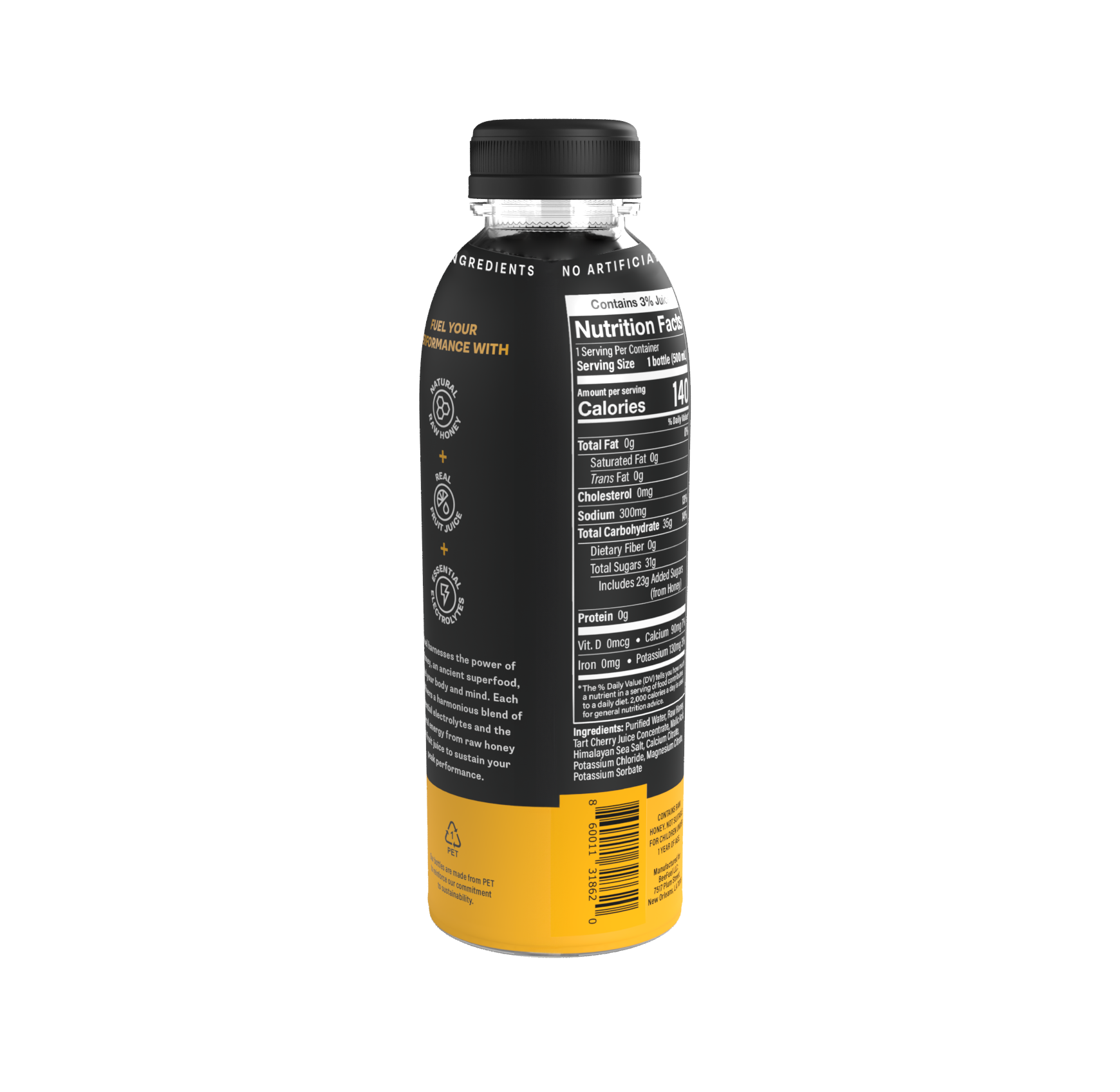
Slide title
Write your caption hereButton
Slide title
Write your caption hereButton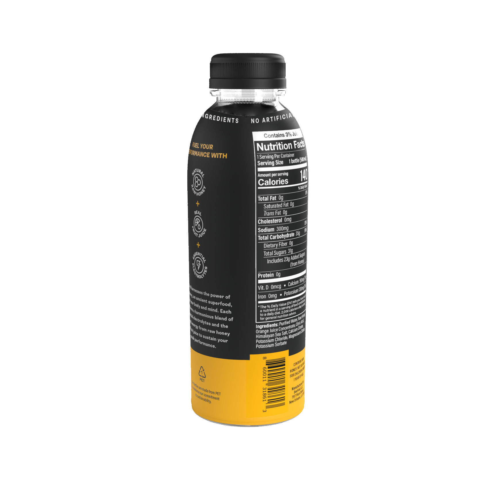
Slide title
Write your caption hereButton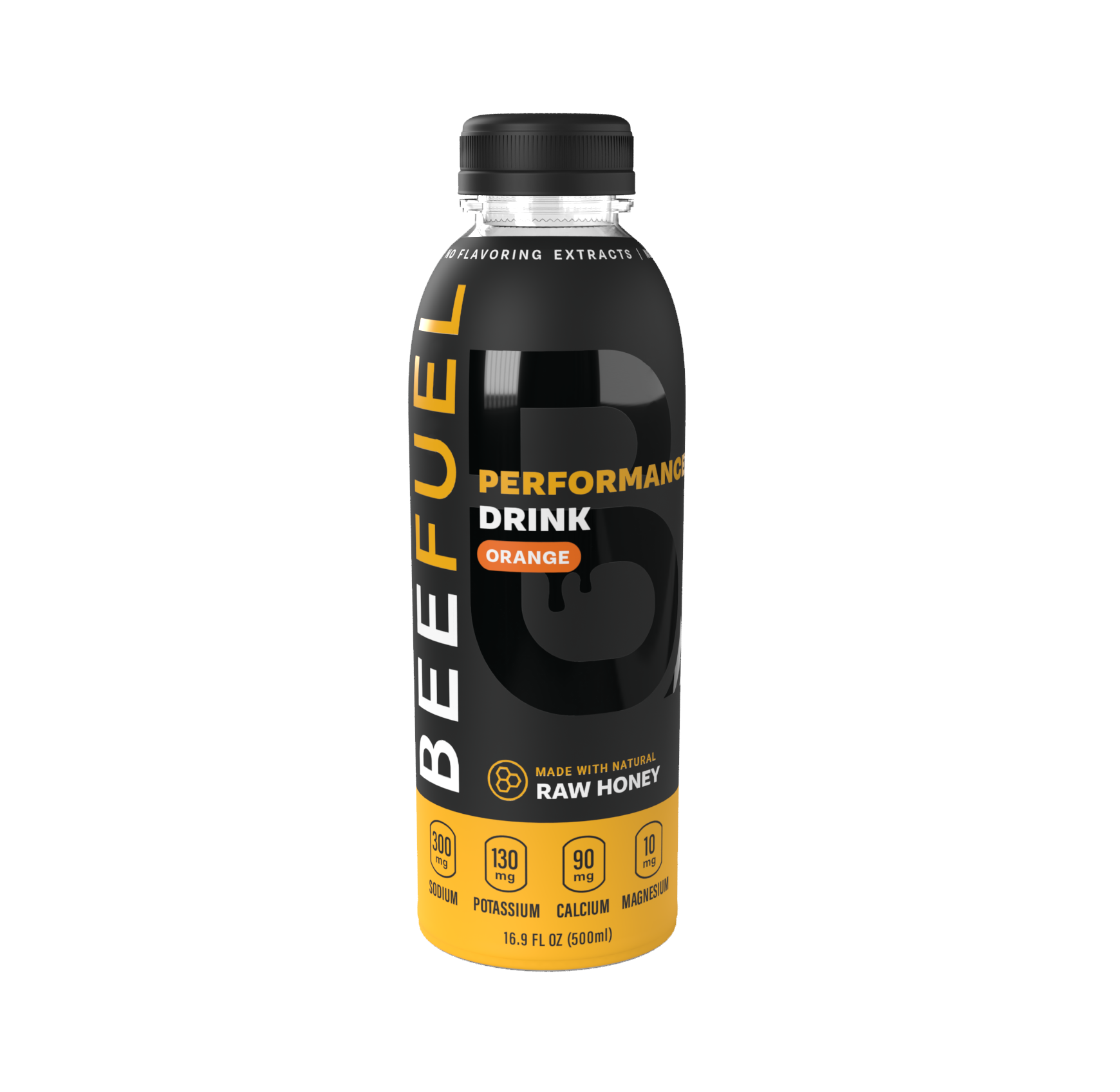
Slide title
Write your caption hereButton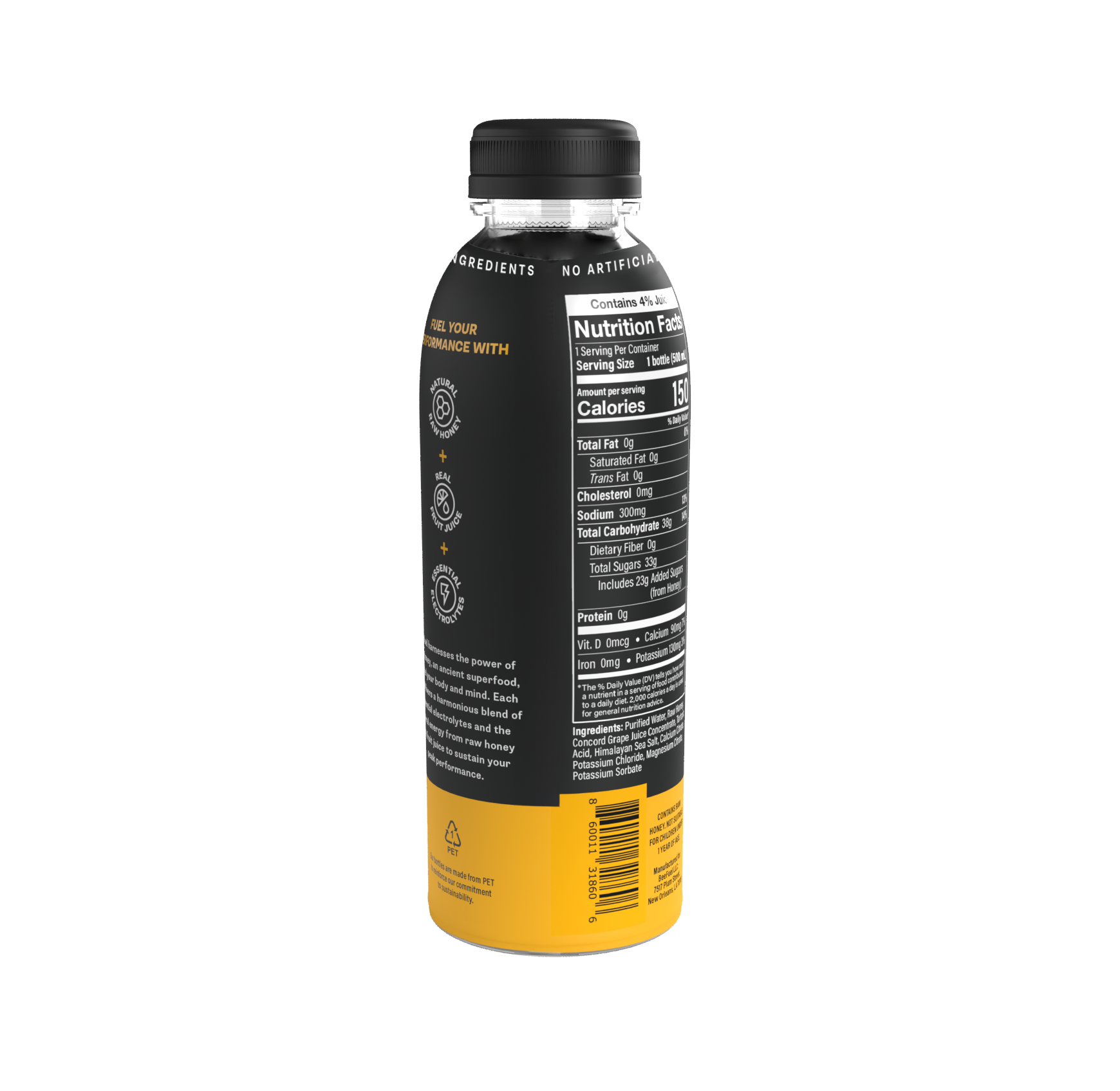
Slide title
Write your caption hereButton

